The latest exhibition at the Museum für angewandte Kunst (MAK) in Vienna showcases the 100 best posters from Germany, Switzerland and Austria. The nature of this medium means you will find lots of (poster) art work based on typography which I find interesting. But what makes a good poster?
In my experience, a poster that catches my attention is usually eye-catching and has a twist. Something unexpected. It may be smart, funny or distracting. But I feel that a good poster typically can use direct and simple words to deliver a clear message.
For anyone seeking more, a great foundary of posters from artists around the world is hosted by typographicposters.com.
One of my favourite poster artists is Alina Rybacka-Gruszczynska, she is a freelance graphic designer and an architect based in Warsaw, Poland. In her design work she says that she “tries to combine visual intuition and engineering education”. In particular, I like how the connection of organic and geometric shapes the work. Take a look yourself in her portfolio.
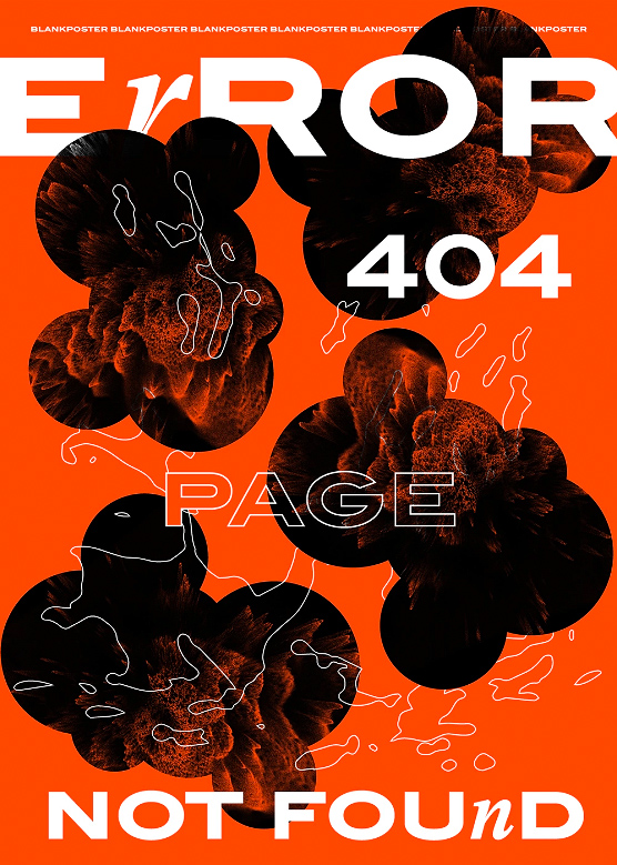
title Error, Poland 2019
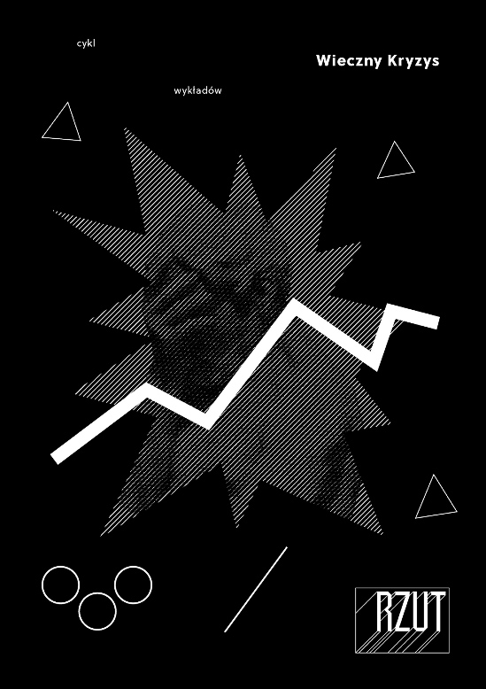
title Wienczny Kryzys, Poland 2019


